top of page

TrailX
UX / UI Design & Installation Design
Integrating a visually pleasing interactive installation, IoT automated edge computing, and dashboard for increased user engagement, safer travel, and easier trail management.
OVERVIEW
2023.9-2024.3
#WebApp
#Interactive Installation
#Data-Driven
#Collabration
Partner
Meta & EasTrail
Global Innovation Exchange in UW
MY TEAM
Chiawei Chang (Engineer)
Ke Wang (User Researcher)
Hon Leung (Product Manager)
MY ROLE
User Researcher
UX / UI Designer
Product Design Lead
VIDEO INTRODUCTION

OVERVIEW
"Eastrail, a beloved trail destination in Seattle's Eastside suburbs, embodies both rich historical significance and vibrant contemporary usage."
The EasTrail system currently faces significant challenges impacting user experience, safety, and community engagement.
Key issues include a gap
in real-time information updates,
safety risks due to high-speed traffic,
and underutilization of the trail's natural and historical attributes.

SOLUTION


"How might we leverage modern technology effectively gather and visualize real-time data on Eastrail's usage and trail user feedback, in a way that seamlessly integrates with the trail's environment and aligns with users' expectations of privacy and experience?"
PROCESS
I identified key challenges through user and stakeholder data analysis and interviews. Following UX/UI design principles, I refined solutions through research, ideation, usability testing, iterative development, and teamwork, enhancing the EasTrail experience.
Define the Goal & Problem
Scope the Stakeholders Need
Design the Solutions and Iterations
Business Goal
Seconday Research
Pilot User Research
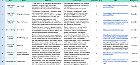
Competitive Analysis
Stakeholders Analysis
Experts Interview
Design System
User Interview
Collaboration
HMW
Question
Persona
User Journey Map
Design Solution
Usability Testing
Prototype
Design Handoff
Affinity Map
Iterations
RESEARCH
-
Secondary Research
We conducted secondary research from design, technology, and business perspectives to inform our approach to enhancing the Eastrail experience.


-
Primary Research
In our comprehensive research, we conducted 19 interviews with trail users, gathered data from 1145 questionnaire responses, and performed field studies across 3 segments of EasTrail. Additionally, we engaged in two expert interviews to further deepen our understanding of user needs and preferences.

-
Users Questionnaire


While the overall user experience on EasTrail is positive, there are several issues on the trail that need addressing. However, there currently isn't an effective channel for reporting these problems.

-
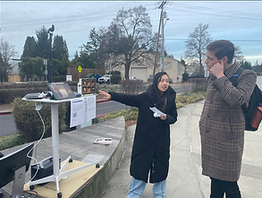
User Interview & Context Inquiry


-
Expert Interview

-
Affinity Map
We used affinity map to find that the EasTrail User Interview & Field Study Results reflect a desire for engaging and educational experiences, community engagement through the trail, and the need for improved amenities and safety measures, particularly concerning fast-moving bikes.

PERSONA
We discovered 3 Personas.

SOLUTION
-
Ideation
Our affinity mapping sessions have synthesized habits and patterns of both EasTrail managers and users, revealing key insights and highlighting valuable design opportunities to enhance the trail experience.


-
Question Definition
Research indicates that
30% of users are dissatisfied with the clarity of signage.
40% consider the facilities subpar.
60% of local residents lack awareness about participation opportunities, highlighting deficiencies in community involvement and interactive features.
-
Our Solution
This device transforms EasTrail into a "Nature Store," where users shop for experiences and knowledge about the natural world, promoting a deeper connection with nature in a safe, engaging manner.


-
For EasTrail
Administrators
-
For Trail
Users

Responsive to different devices👇:


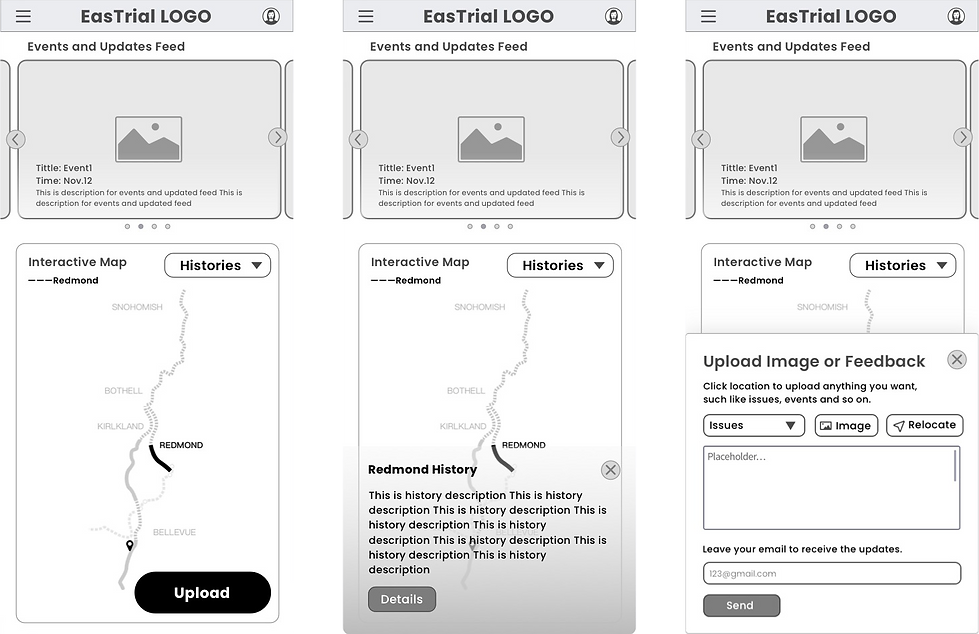
WIREFRAME


DESIGN SYSTEM

Hardware & Software Architecture

USABILITY TESTING
Our two rounds of usability testing yielded overwhelmingly positive feedback, with an approval rating of 4.5 out of 5. Users were particularly satisfied with the design of both the installation and the web app, citing ease of learning and usability.
A preference for digital over paper receipts was noted, alongside a suggestion for more attractive information presentation to boost retention.


bottom of page